
Saving mobile users 6 minutes each day by improving navigation to the GoSpotCheck features they use the most
The Hamburger Menu
When we first launched the GoSpotCheck mobile app, hamburger menus were all the rage. You know, those three little horizontal bars that resemble a hamburger and when clicked, lead you to a hidden menu of destinations in an app or a website. And it worked well for a while; but over the years, we started hearing feedback from our mobile app users that the menu icon was difficult to reach on many of the newer, larger phones. More importantly, many of them felt like they were spending too much time navigating, and not enough time completing their work.
So we decided to investigate. And you know what we found? They were right! On average, mobile users were spending around 6 minutes each day navigating to various places inside the hamburger menu. And it turns out those places were not so “various”: for more than five (of the six) minutes spent inside the menu, users were toggling between just two mobile app pages: Choose a Place and My Activity.
This discovery raised an interesting question for us:
How could we make it easier and faster to navigate to the most frequently visited pages of the mobile app?
The Solution
After a lot of brainstorming, designing, testing with customers, and iterating based on their feedback, we arrived at a solution that will feel very familiar to almost anyone with a mobile device:
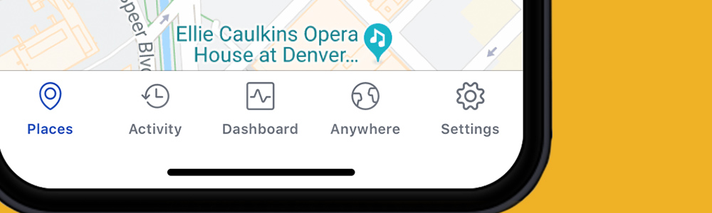
The design places the two most “toggled-between” pages of the mobile app (Choose a Place & My Activity) front and center, making it easier than ever to navigate GoSpotCheck on-the-go. Do you use Anywhere Missions to enable your team to complete Missions not associated with any place in particular? How about MyDashboard to arm your team with custom reports and scorecards right inside the app? You guessed it: You’ll soon find both in their new home in the tabbed navigation bar as well.
Feedback so Far
This year during our REIMAGINE Customer Conference, we hosted a UX Lab where we got to demo the new tabbed navigation bar to attendees and capture their reactions in real-time.

The feedback during the UX Lab was overwhelmingly positive. There seemed to be a lot of confidence in the solution saving mobile app users time, enabling them to navigate with greater efficiency, and therefore being able to get to work more quickly.
But don’t take our word for it; here’s what a few folks shared with our team:
- “Clean, simple layout and design”
- “Icons at the bottom of the screen are nice and will improve user experience.”
- “The ability to limit time spent on switching from screen to screen on a daily basis gives our reps more with less in the new format”
When can I Try It?
While we don’t anticipate officially rolling out tabbed navigation for everyone for a few months, interested users can get a sneak preview beginning next month. Watch the App Store release notes for instructions on how to opt-in to the early access program (spoiler alert: it’s super easy to do!) and you’ll be able to take the new user interface for a test drive. As always, your thoughts and feedback on the experience mean the world to us, so we’ll be asking all early-access users to share their thoughts once they’ve had the chance to kick the tires a bit!
Why it Matters
At first glance, 6 minutes a day may not seem like much. But over the course of 30 days, it can really add up: We’re talking 2-3 hours saved each month! With tabbed navigation in the mobile app, we’ll unlock the time your team used to spend navigating and tapping around the hamburger menu -- so they can spend it on more meaningful work that drives results for your business.
We know that happy, engaged employees create happy, engaged customers. It’s our hope that in constantly striving to improve the GoSpotCheck mobile experience with updates like tabbed navigation, we can contribute in some small way to a happier and more engaged team to improve the customer experience.