How a hunch about Powerpoint exports led to a completely reimagined Photo Reporting solution, as told by GoSpotCheck Product Designer, Danielle Gardner.
In 2019, we met with our Customer Advisory Council to discuss how our customers were exporting and sharing photos from Photo Album and explore opportunities to improve that process.
We knew that PowerPoint exports were the preferred format for generating photo reports. However, our Advisory Council shared with us that sometimes, those Powerpoint file sizes were very large, which made sharing these exports via email problematic. While PDF exports were an option, they had some constraints of their own (less configurability, smaller image sizes, etc). In some instances customers would actually export photos into PowerPoint, convert it to a PDF, upload it to a file sharing service, and then email the link to the file. Yikes.
There had to be a better way.
The Decision to Rebuild Photo Album
Photo Album launched in 2016 as a brand new way for customers to visualize and manage the photos they captured in GoSpotCheck all in one place. In the years the followed, as our customers usage of the application grew, so too did their imaginations of what they wanted it to be able to do.
For example, as an alternative to the PowerPoint file size share-ability challenge our Advisory Council voiced to us, several of our customers envisioned new ways of sharing specific subsets of photos directly from Photo Album via URL.
As our customers needs and desires continued to evolve and take shape, it became more and more clear that perhaps some of the technical constraints of the original application might inhibit Photo Album's ability to evolve and grow with the kind of agility our customers deserved.
So, instead of spending our time addressing and resolving those technical constraints, the decision was made to invest in a team who would be charged with rebuilding the product from the ground up.
As a team, we set out to answer the following question:
How might we design and build a photo reporting solution as powerful as our analytics platform and as intuitive as a consumer photo application?
The Design Process
It’s a common misconception that the designers simply come in at the end to make things look good. Here at GoSpotCheck, our design process includes everything from talking to users about how they use the product to the final visual design.
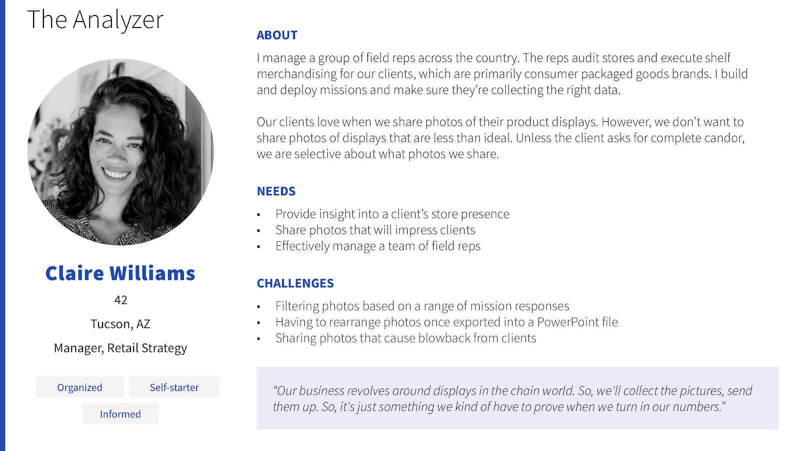
The first thing we did was conduct additional user research. While we thought we had a pretty clear idea about the existing issues with Photo Album, we wanted to make sure we were very clear about the problems we needed to solve. We conducted multiple usability interviews, identifying pain points within the current version of Photo Album, discussing how users were managing the photos from missions, and how to improve their experience. As you’ll see below, what we learned in these interviews directly influenced the designs for PhotoWorks. These interviews also informed our user personas, a tool we use to help the team center around specific user needs and problems.
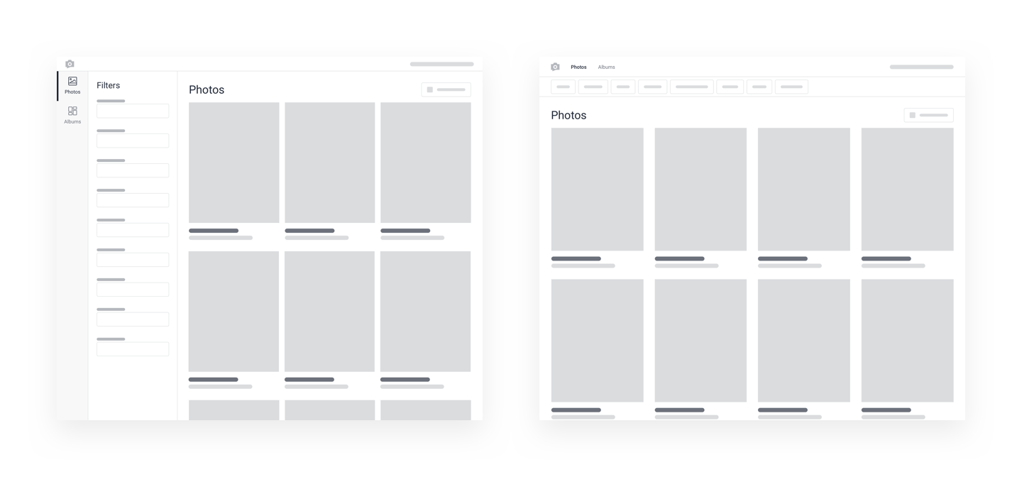
Once we were clear on the problems PhotoWorks would be solving, I began sketching and wireframing potential design solutions. This allowed me to quickly iterate on designs and compare multiple options without too much of an investment. One example that I explored was having the navigation and filters on the side versus on the top of the screen. The wireframes helped show that having the navigation and filters on the top of the screen would allow the photo grid to have more screen real estate and allow users to easily scroll through their photos.
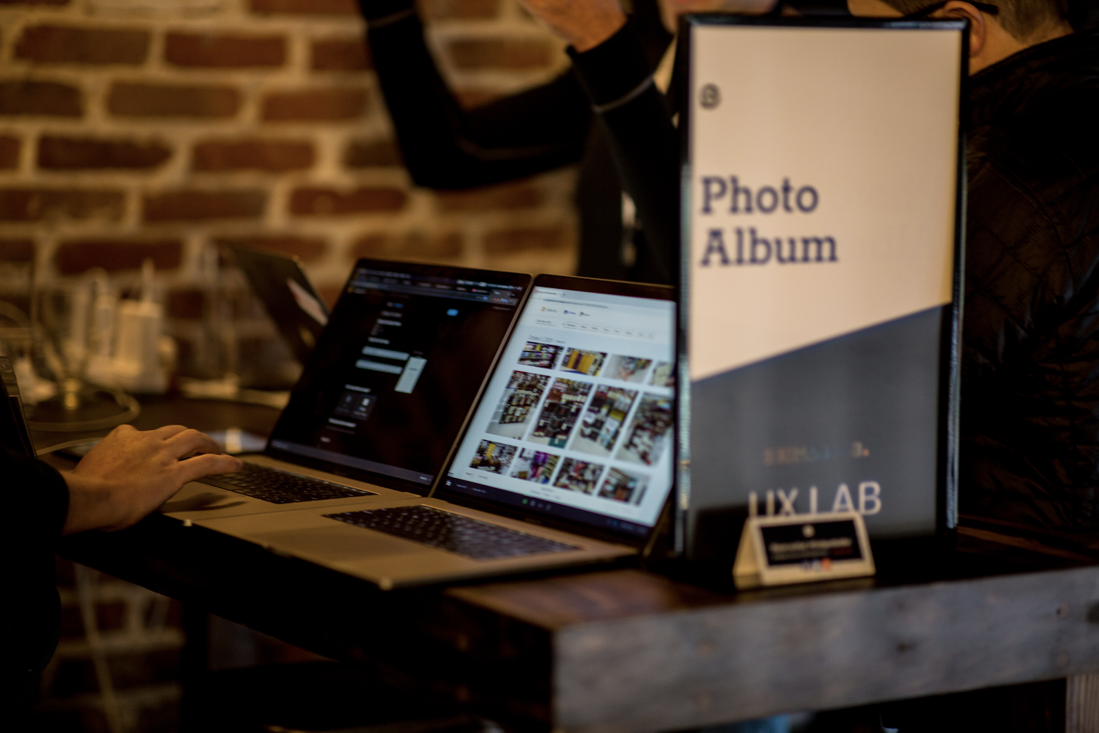
At our Reimagine conference last fall, we showed some of these wireframes in the UX Lab to collect feedback and iterate on the design. It confirmed we were on the right track and also gave us more great ideas to consider. After months of researching, testing, and iterating, I finished designs for what would be included in the initial release of PhotoWorks. Since then I have been working with the Product Manager and Engineers to make those designs come to life.
Introducing PhotoWorks
User research interviews, feedback from stakeholders, design reviews, and usability testing sessions all contributed to the current design of PhotoWorks. Many of these examples have been shared informally at GoSpotCheck, but I wanted to offer further insight into “why” certain design decisions were made and how they shaped features of PhotoWorks.
Responsive Design
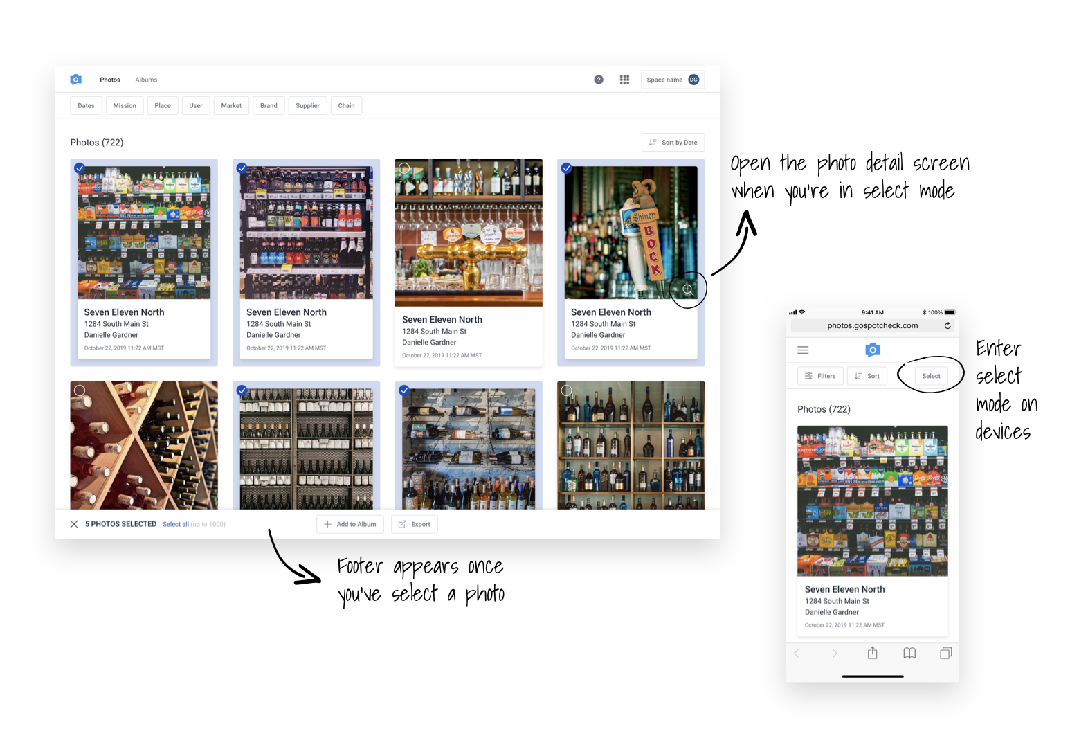
Allowing users on mobile devices to access Photo Album had been requested by many of our customers. GoSpotCheck is designed to enable field teams to do great work. This means our users are on a variety of devices and our products should be accessible on the devices they're using. Throughout the design process, we considered how every screen should dynamically change to optimize the experience based on the device and screen size being used. A great example of this is how a user selects photos. On mobile devices a user cannot hover over a photo with their mouse and then click on it to select the image. When we recognize a user is on a mobile device, we added a ‘Select’ button that opens a select mode where the user can then simply tap on photos to select them.
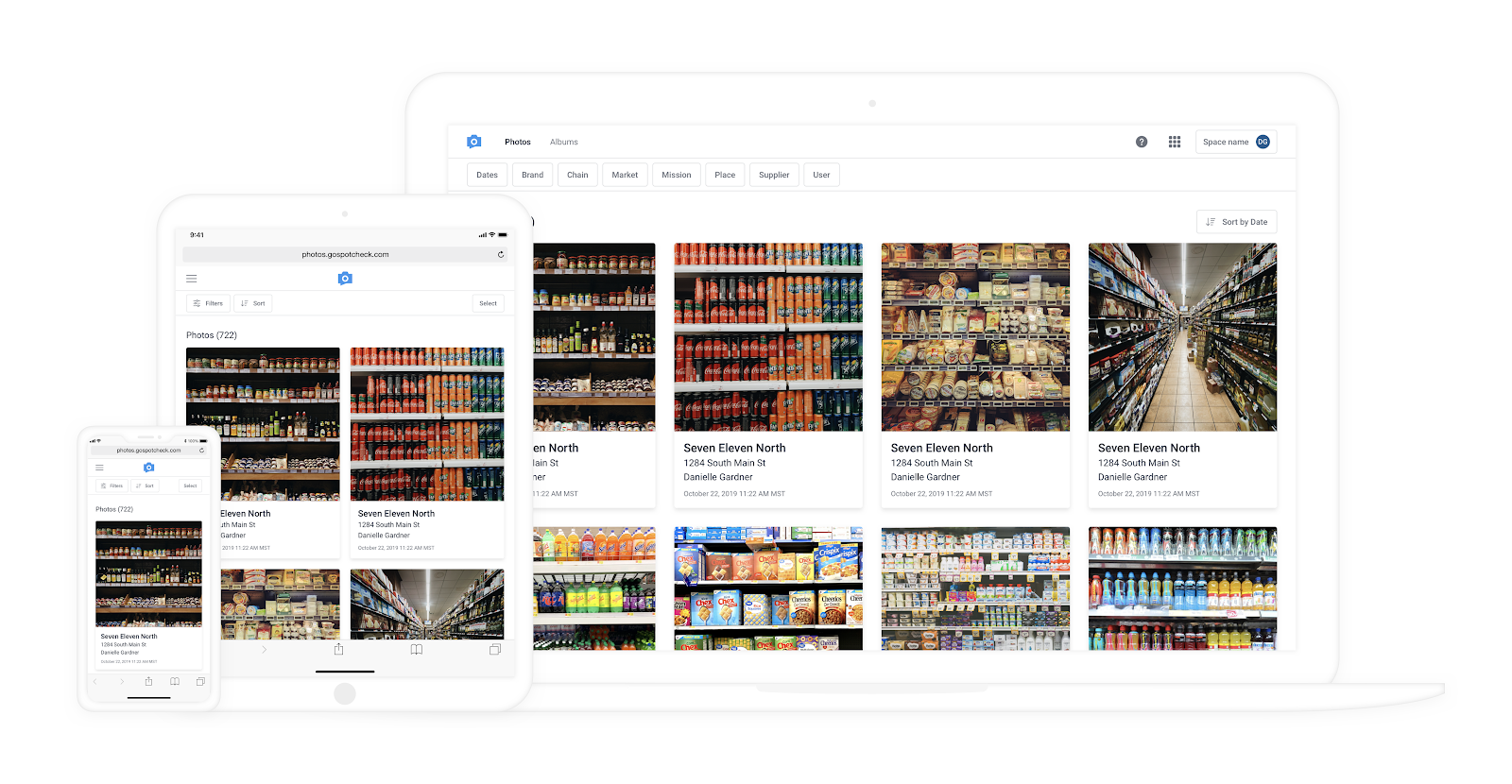
Photo Grid Updates & Photo Detail View
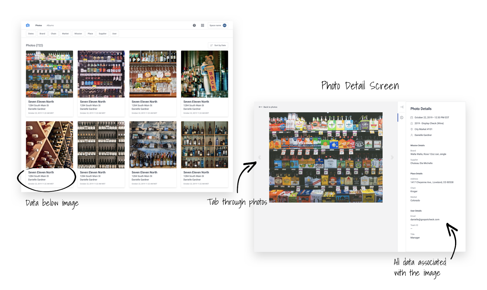
As we conducted our user research interviews, it was clear that users are looking for small details in the photos to accomplish tasks such as counting facings in a cooler or checking the promotional price tag on a display. While metadata was important to users, in Photo Album, it was overlaid on the photo itself, often obscuring parts of the image. This caused the user to have to turn the metadata off and on when reviewing photos. Additionally, while Photo Album could expand the photo in a new tab, this tab did not include any of the image's metadata. Users needed the ability to view a photo at full size alongside the corresponding metadata. We wanted to allow the users to see the photo without the data covering the image, so PhotoWorks shows the details below the image on a card style layout. In addition, clicking on the image takes the user to a full screen detail view where they can see the image with all of the metadata associated with it in a single view. If they are auditing a set of photos, they can even navigate through photos from the detail view without returning to the grid.
Selecting Photos
If you used Photo Album before, you may have noticed that the interaction of selecting a photo has changed. In the past if you clicked anywhere on the photo it would ‘select’ that photo. Now in PhotoWorks, you select the circle in the top right to select the photo. This was changed so that if you click on the photo itself, it takes you to the new photo detail view. When testing this with users that weren’t familiar with Photo Album, it was clear to them that clicking on the photo would take them to the detail view and they would need to select the icon in the corner to actually select the photo.
During our beta period, we received some additional feedback that users would still like to access the detail view even after they have their photos selected, so we are taking that feedback and iterating on the design. Coming soon, if you hover over a photo you can click on the ‘Zoom’ icon in the lower right of the photo you can still access the photo detail view.
Pro Tip: you can also try holding down the CMD or ALT key and dragging your mouse over photos to select them as well.
Filters
Some of our customers have can be hundreds of thousands, if not millions of photos in their PhotoWorks library. But no matter the size of the library, it is critical to be able to narrow down and locate the subset of photos you are looking for as quickly as possible. During our research interviews, several participants found the filters in Photo Album to be cumbersome. One of the biggest problems with filtering was that they were not relational. Users would select a handful of values, apply the filters, and then find out that no photos matched those filters and have to start over. This was extremely frustrating and inefficient.
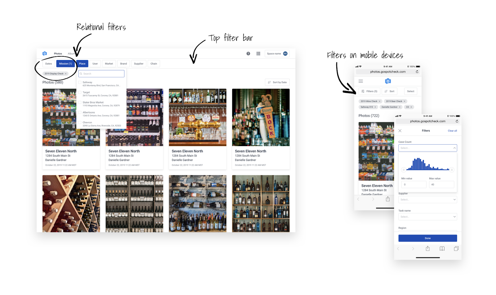
In PhotoWorks, the filters "talk" to one another, so once a user selects a filter, other filters narrow down to options that match that first filter's criteria. Having the filters displayed in a side panel meant that the dropdown area was small and most values were truncated, another reason we decided to move them to the header above the photos. In addition, the dropdown would close after every selection and the user would have to start searching again, a waste of time if they wanted to quickly select multiple similar values. The dropdown now stays open after a user selects a value until they click outside of the dropdown. We’re hoping all of these changes will improve the filtering experience and reduce the amount of time it takes for our customers to find the precise photos they are looking for.
Sorting
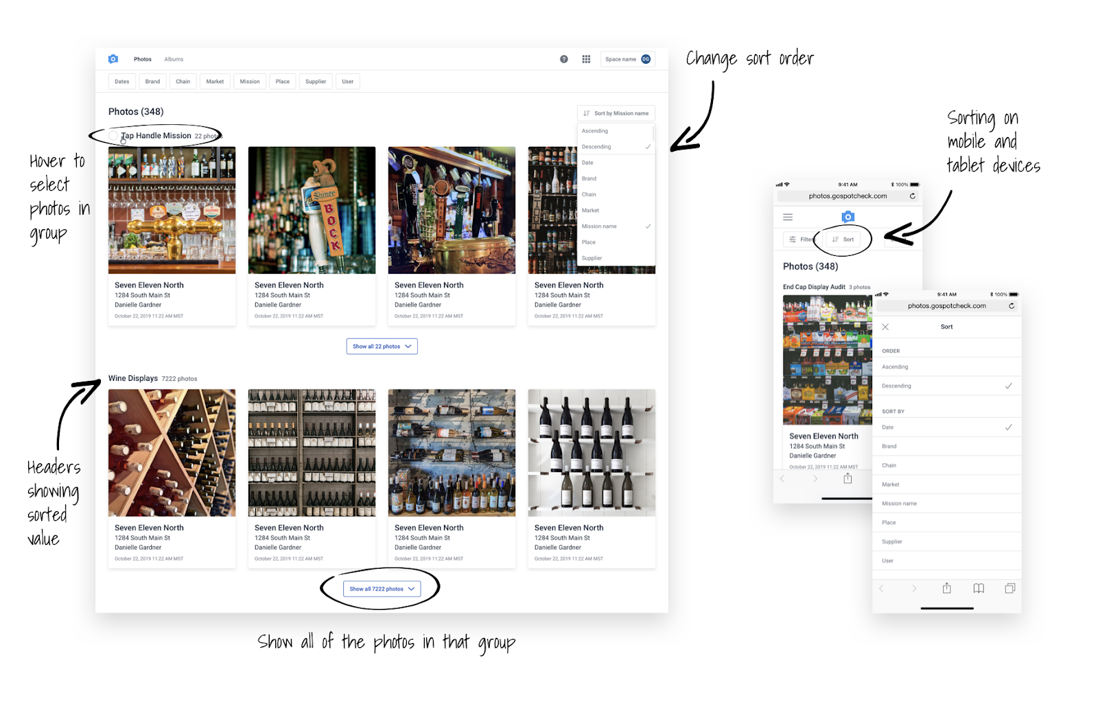
During the user research sessions and in the UX lab at Reimagine, users stated that they needed a better way to group and categorize photos. Users were currently restricted to a chronological sort. One user even stated that if there were different options and more flexibility to sort the photos, it would have the potential to save him hours per week. Many customers worked around the lack of sorting by exporting the photos into PowerPoint and then manually rearranging the photos, which was time consuming. With the launch of PhotoWorks, we introduced a brand new sorting functionality to change the order in which photos are displayed before exporting. When you are sorted by date (the default), the date is always shown on each photo card. However, if you sort by something like ‘Place name’, that data might not be on each photo, so we added in headers to display the values. Each of the values might contain thousands of photos so we decided to only show the first few photos in each section and then the ability to load the rest of the photos if you need to. This allows the user to quickly scroll through the sections to find what they are looking for. The sort order will also persist on the export so users don’t have to rearrange the photos once they are exported.
Exports
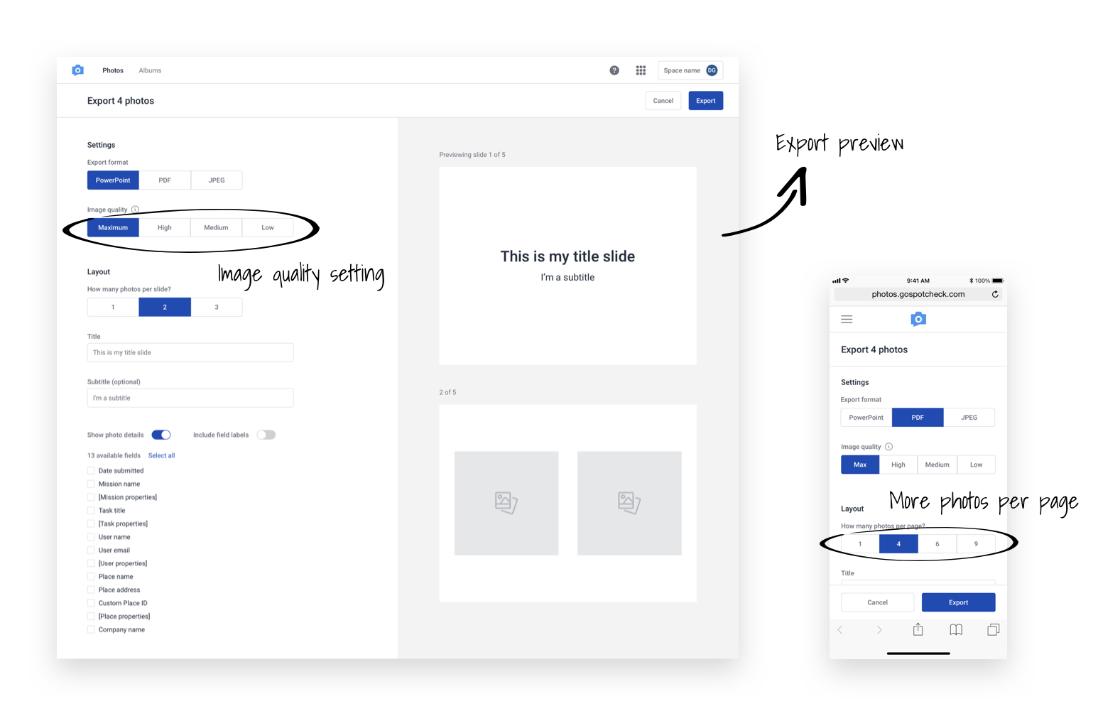
Exports were something that our users loved about Photo Album, and worked pretty well. During the UX lab and some of the user testing sessions, we received some suggestions to improve upon what we already had. One of those suggestions was the ability to show a preview so you can see how things will look before you export, preventing them from having to adjust the details and export again. Large file sizes seemed to be a common problem, and we had two great suggestions to address this. The first was the option to show more photos per page (and thus creating smaller documents) and the option to change the image quality to export photos at a lower resolution for a smaller file size.
Albums
Photo Album did not allow users to easily save and share important photos. In order to share photos, users had to download them and then upload it to their own file-hosting system or email before sending it to stakeholders. Some users don’t have access to a file-hosting system like Box or SharePoint. If they relied on email to distribute photos from Photo Album, they were limited by file-size restrictions on their own server, as well as the email clients of their customers. This resulted in a customer admin sending multiple emails with attachments, rather than one album of relevant photos. The ability to share photos directly, can save our users a substantial amount of time and frustration. Albums were designed in response to all of the great feedback we heard about users wanting to save and share photos directly from PhotoWorks.

Real time data & 10x performance improvements
The credit for this goes to our engineering team for architecting and building PhotoWorks in a way that allows users to view photos in real time and with significant performance improvements. It’s 90% faster and includes a vastly improved user experience when loading and scrolling photos. During our research we validated the problems caused by having a lag between when photos were taken and when they were visible in Photo Album. It created communication problems with Admins and Reps (i.e. Did you submit photos from this account?). Users would have to go into Web Dashboard and navigate to photos within a mission or a place to find photos submitted in the last few hours. No one wants to see data from yesterday when you are trying to solve today’s problems.
What’s next?
We are excited that PhotoWorks has officially launched and is now available to all of our users. There are a few upcoming features on the roadmap that will hopefully continue to make PhotoWorks an even better experience. There are also many more features and requests we heard during research and testing that weren’t in the initial release of PhotoWorks, but we will continue iterating and improving the product. If you have any suggestions for improving PhotoWorks, don't hesitate to reach out and I would love to chat with you!
